Mixing patterns without making a mess of it
Updated August 2026 · Sam’s Menswear editorial team
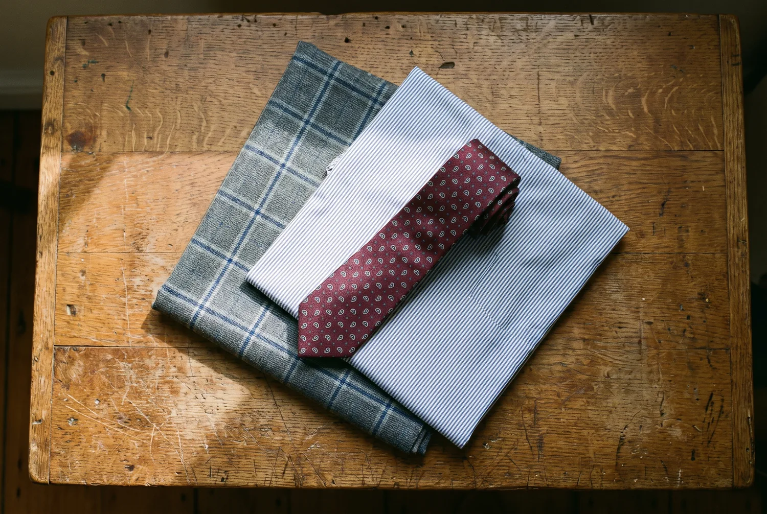
Most men solve this by never doing it. Plain suit, plain shirt, patterned tie, done — and that is a perfectly good way to dress for thirty years. Nobody has ever been badly dressed in a navy suit and a white shirt.
But it is worth knowing the mechanism, because once you see it you can stop guessing.
The rule: change the scale
Two patterns work together when they are different sizes. They fight when they are the same size.
That is it. That is nearly the whole subject.
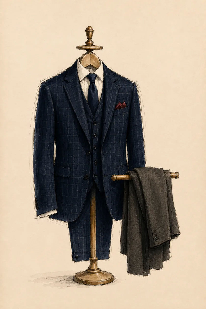
The reason is how the eye works. A wide windowpane check on a jacket and a fine pinstripe on a shirt are read as two distinct things — one is background, one is texture, and your eye sorts them without effort. A windowpane check on the jacket and a check of roughly the same size on the shirt give the eye no way to separate them, so it keeps trying, and the result is that faint visual buzz that makes a man look busy from across a room.
So before you think about colour, ask one question: are these two patterns obviously different sizes? If yes, you are most of the way there.
How to build it
Two patterns. Pick a large one and a small one. A bold windowpane jacket with a finely striped shirt. A subtly striped suit with a tie carrying a small repeating motif. Easy.
Three patterns. Now you need three clearly different scales — large, medium, small — and you should pull the colours into one family so the whole thing reads as deliberate. A grey windowpane jacket, a fine blue-striped shirt, a small-motif burgundy tie. The blue and burgundy are quiet enough that the grey holds it all together.
Three patterns is genuinely where the fun is and also where it goes wrong. If you are unsure, stop at two.
Four. Add a pocket square, keep it the smallest pattern or make it plain white, and stop. Nobody needs to attempt five.
Colour does the rest
Scale keeps patterns from fighting. Colour is what makes them look like they were chosen together.
Keep everything in one temperature. Cool with cool, warm with warm — greys and blues and burgundies together, or browns and olives and rusts together. Mixing a cold blue-grey jacket with a warm rust tie is the second most common way this falls apart, after scale.
Which family suits you personally is a separate question and it has its own answer: which colours actually suit you.
And repeat one colour, once. If the tie has a thread of blue and the shirt is blue, the whole thing locks together. Repeating it three times is too neat and starts to look like a costume.
Texture counts as pattern
This is the part that catches men out.
A flannel, a tweed, a hopsack, a grenadine tie — none of these has a printed pattern, but all of them have visible surface. A herringbone is a pattern, whether or not you think of it as one. So is a birdseye, and so is a nailhead.
Two textured cloths at the same scale will do exactly what two checks at the same scale do. A herringbone jacket over a herringbone tie is a mismatch even though both are technically “plain.”
The upside: texture is the easiest way to make a plain outfit less flat. A navy grenadine tie against a plain navy suit is technically two solid colours and it does not look like it, because the weave breaks up the light.
The safe way in
If you want the shortest path to looking well put-together without thinking about any of this:
Patterned jacket. Plain shirt. Patterned tie at a smaller scale.
The plain shirt sits between the two patterns and separates them, so the scale rule takes care of itself. This combination has been correct for a hundred years and it will still be correct when everything on this page has gone out of fashion twice.
The next step up: plain suit, striped shirt, small-motif tie. Also very hard to get wrong.
The one to avoid
A striped suit with a striped shirt where the stripes are close in width. It is the single most common failure and the most uncomfortable to look at, because vertical lines at similar spacing genuinely do interfere with each other optically.
If you want stripes on stripes, make the difference obvious: a bold chalk stripe suit with a very fine hairline shirt stripe. Halfway does not work.
Where the fabric book comes in
All of this is much easier to see than to read about, and it is one of the real advantages of choosing cloth in person. Two bunches held together on the bench tell you in a second what a paragraph cannot: whether the scales separate, whether the temperatures agree, whether the whole thing calms down or starts to buzz.
Bring a shirt you already own and a tie you actually wear. Most men bring nothing, choose a beautiful cloth in isolation, and find out afterwards that it argues with half their drawer.