Which colours actually suit you
Updated August 2026 · Sam’s Menswear editorial team
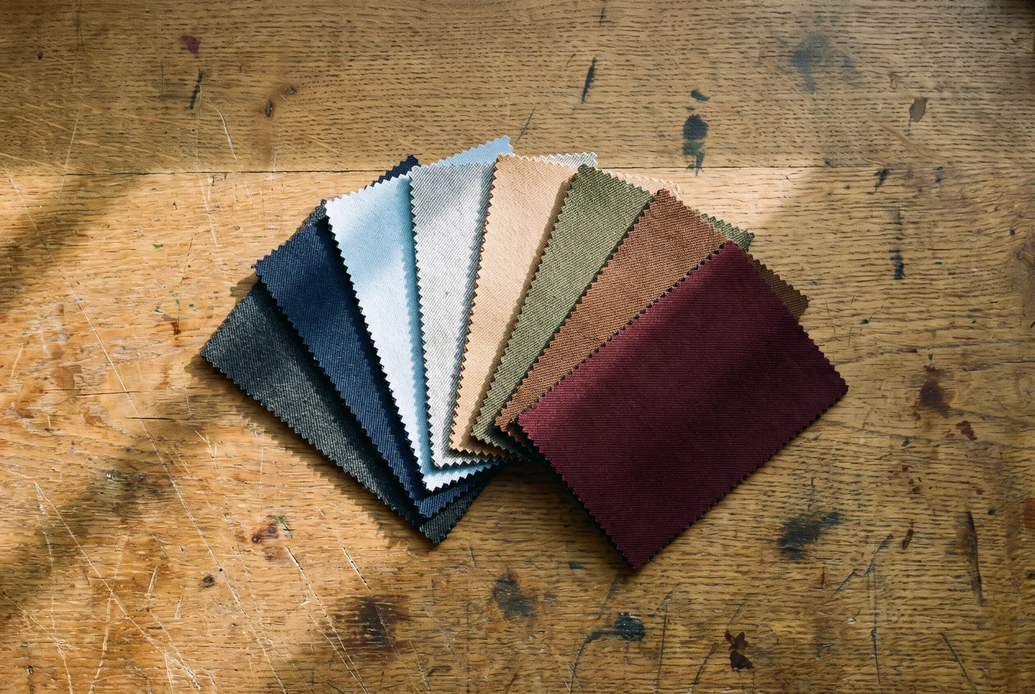
Men come in and say “I don’t think I can wear blue,” and nine times out of ten what they mean is that they once bought the wrong blue. There is a large difference between navy and royal, and almost nobody is unable to wear an entire colour.
There are two questions worth answering, and you can answer both in front of a mirror before you go anywhere near a fabric book. Do them by a window. Not under a bathroom light, not under an office fluorescent — both of those lie, and they lie in different directions.
Question one: are you warm or cool?
This is about the undertone in your skin, which is not the same as how light or dark you are. Two men with the same complexion can sit on opposite sides of this.
The test. Find something silver and something gold — a watch, a ring, two pieces of kitchen foil if that is what is to hand. Hold each one under your chin in daylight, one at a time, and look at your face rather than at the metal.
One of them will make your skin look clearer and more even. The other will make you look slightly tired, slightly yellow, or slightly grey. It is usually obvious once you look for it, and if it genuinely is not, you are probably neutral and both work.
Silver looked better: you are cool. Your best colours have blue or grey underneath them. Navy, charcoal, true grey, ice blue, burgundy, emerald, pure white.
Gold looked better: you are warm. Your best colours have yellow or red underneath. Camel, olive, warm brown, rust, cream, forest green, and blues that lean teal rather than royal.
A second check if you want one: look at the veins on the inside of your wrist in daylight. Blue or purple leans cool. Green leans warm. It is a rougher test than the metal one but it usually agrees.
Question two: how much contrast do you carry?
This is the one almost nobody has heard of, and it explains more than the first.
The test. Stand in front of a mirror in daylight and defocus your eyes, or take a photograph and turn it black and white on your phone. Ignore colour entirely. Look only at how far apart your hair and your skin are in darkness.
High contrast — dark hair against light skin, or the reverse. Think black hair and pale skin, or very dark skin with white hair.
Low contrast — hair and skin close together in tone. Fair hair and fair skin. Mid-brown hair and olive skin. Grey hair and pale skin. Most men over sixty drift down into this group whether they like it or not, which is why a suit that suited a man at thirty can stop suiting him.
Medium — most people, somewhere between.
Now the useful part.
If you are high contrast, strong pairings look right on you and soft ones look washed out. Charcoal suit with a white shirt. Navy with white. This is why some men look extremely well in stark combinations that make other men look severe.
If you are low contrast, those same strong pairings overpower you. The suit and shirt end up being the thing people see and your face becomes the quiet part. What flatters you is tones closer together: mid grey rather than charcoal, blue or cream shirts rather than bright white, brown and olive rather than black.
This is the single most common mistake I see. A fair man with fair hair in a black suit and a bright white shirt has put the two strongest values in the room next to a face that does not have that much power, and the outfit wins.
Putting the two together
You now have two answers. Here is what they point at.
Cool and high contrast. Charcoal, navy, true grey. White and pale blue shirts. Burgundy, deep green, silver-grey ties. Black works on you, which is unusual — most men are better in charcoal.
Cool and low contrast. Mid grey, softer navy, blue-grey. Blue and pale pink shirts rather than stark white. Ties in dusty, muted versions of the same family. Avoid black next to your face.
Warm and high contrast. Deep brown, dark olive, rich navy. Cream and light blue shirts. Rust, gold, forest green. You can carry a strong brown that would swallow other men.
Warm and low contrast. Camel, taupe, mid brown, soft olive, lighter greys with a warm cast. Cream shirts. This is the group best served by a fabric book and worst served by a rack, because most ready-made suiting is cut in cool greys and navies.
The colours that are less fussy than their reputation
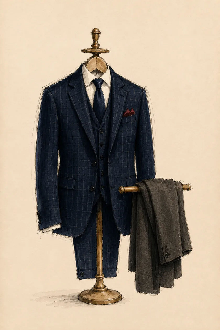
Navy suits almost everyone. It is the most useful suit colour there is and the reason every man is told to buy it first. The variation matters though: a cool man wants a navy with blue depth, a warm man wants one that leans slightly softer and less electric.
Mid grey is the other near-universal. It is more forgiving than charcoal for low-contrast men and less severe than black for everyone.
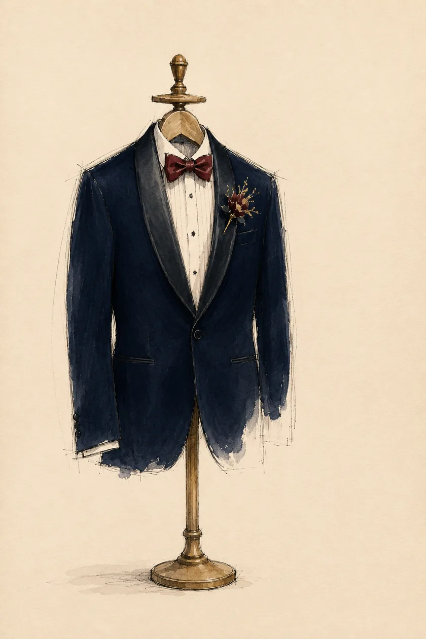
Black is the one with a reputation it has not earned. It suits high-contrast, cool-toned men and it suits evening. On most other men in daylight it is heavy, it flattens the face, and it reads as a uniform. Charcoal does everything men want black to do and does it more kindly. If you want black for evening specifically, that is a different garment and a different conversation: the custom tuxedo.
What this is and is not
This is a useful framework, not physics. Nobody is forbidden a colour, and every rule here bends for a fabric you genuinely love. Confidence in a suit you are pleased with beats theoretical correctness in one you tolerate, every time, and I have watched it happen for thirty years.
What the framework is good for is narrowing a fabric book. Two hundred blues is not a choice, it is a fog. Knowing you are warm and low contrast turns it into eleven blues, and then you can actually decide.
Do it in daylight, on you
The last thing, and the one that matters most: no colour tells the truth under a shop light, or on a screen, or held on a table. It has to be held against your face, by a window, on the day.
That is not a sales line, it is the reason the fabric books at the studio live near the window and why the first appointment is spent putting cloth under men’s chins rather than talking. Two greys that look identical in the book separate completely once they are next to your skin. You will see it immediately, and so will whoever you brought with you.
Bring someone, in fact. You look at your own face too often to see it.