Suit colours that actually photograph well
Updated July 2026 · Sam’s Menswear editorial team
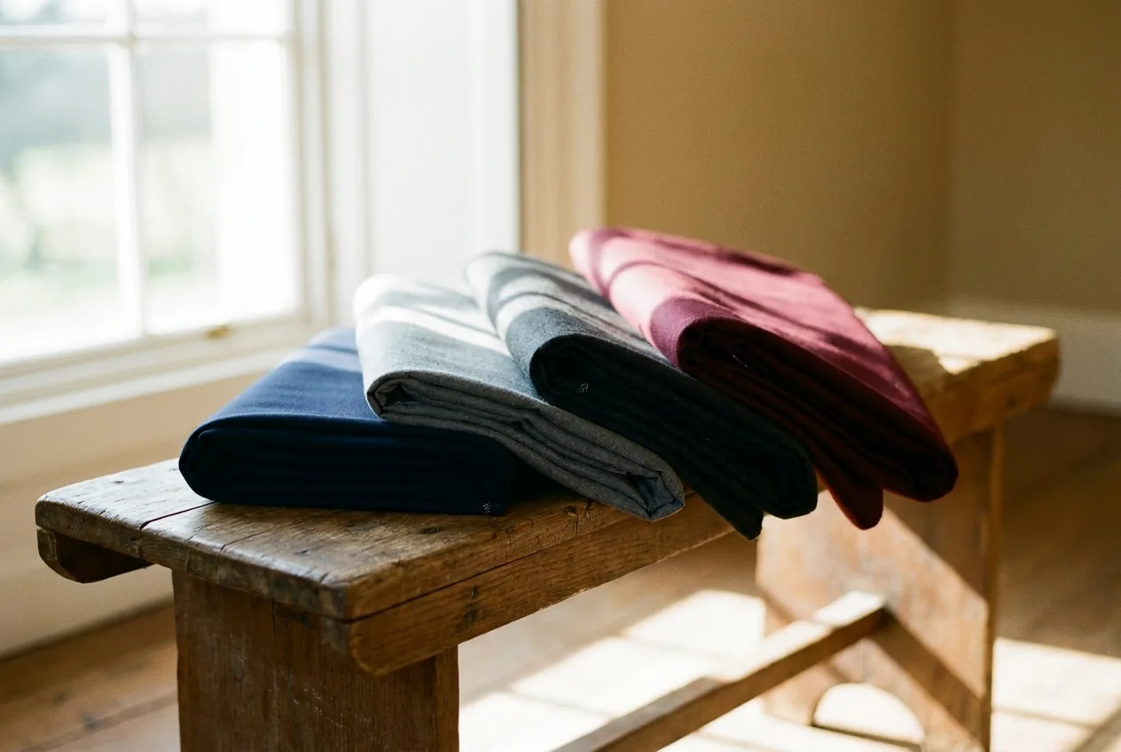
Navy and charcoal are the safest colours you can wear in wedding photos. They hold their true colour in daylight and under flash, keep detail in the fabric so you don’t turn into a dark blob, and contrast cleanly with a white dress and almost any background. Earth tones (tan, stone, sage, warm brown) photograph beautifully in daylight but soften as the light drops.
Here’s the honest version, from someone who’s dressed a lot of grooms and seen how those photos come back.
What suit colour photographs best for a wedding?
Navy first, charcoal second. Both stay true across daylight, shade, and flash, and both give the camera enough tonal range to keep the weave and shape of the suit visible.
The reason is simple: a camera needs some detail to grab onto. Navy and mid-to-dark grey sit in a range where the lens still reads the lapel roll, the drape, the texture, so you look like a man in a well-cut suit, not a silhouette. They also make a white dress pop next to you without fighting it. If you want a colour you’ll never regret in an album, it’s navy. Start with the wedding page and we’ll build from there.
Why does navy photograph so well?
Navy holds its colour in nearly every light (bright sun, overcast, indoor flash) and reads as rich and intentional rather than flat. It’s the most forgiving colour in the room.
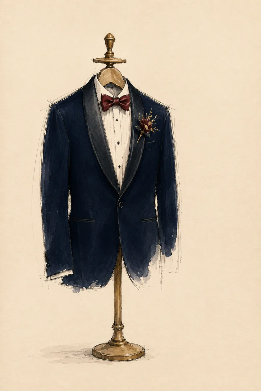
Black can go dead and shapeless in a photo; pale grey can wash out to near-white under flash. Navy sits right in the sweet spot between them. It’s dark enough to look formal and sharp, light enough that the camera keeps the fabric alive. That’s why photographers quietly love it. Pair it with a crisp white or soft blue shirt and the contrast does half the work for you.
Do charcoal and grey photograph well?
Yes. Charcoal is the other safe anchor. Medium-to-dark grey behaves almost as well as navy across lighting conditions and looks especially good in softer, evening light.
The one to watch is light grey. In bright sun or under a hard flash it can lose its colour and read washed-out, especially next to a white dress where it starts to blend in. If your day is mostly outdoors and mid-tone, light grey is lovely. If there’s a lot of flash photography (a dim venue, an evening reception) lean toward charcoal or midnight blue instead. When you design your suit we’ll match the shade to your actual timeline, not a swatch under a shop light.
What about earth tones and brown suits?
Earth tones (tan, stone, sage green, warm brown, olive) photograph genuinely well in daylight and give you warmth and personality that navy can’t. The trick is they depend on good light.
In afternoon sun or open shade, a stone or tan suit looks relaxed and modern and reads beautifully in an album. As the light drops toward evening, those same tones go muddy and lose their glow. So earth tones are a daytime and golden-hour move. If your wedding runs into the night, keep an earth tone for the ceremony and photos, or choose a deeper version, a rich brown or forest green, that holds up better once the flash comes out. Our fabric library has the earth-tone fabrics that keep their character on camera.
What suit colours should you avoid in wedding photos?
Three traps: pure black, very pale colours under flash, and anything with a fine, tight pattern.
- Pure black can photograph as a flat, shapeless dark mass: the camera loses the lines of the suit and you disappear into shadow, especially indoors. If you want that formal depth, midnight blue reads as “black” to the eye but keeps its detail on camera. It’s the better move nine times out of ten.
- Very pale suits (cream, pale grey) can blow out under a photographer’s flash and read as plain white. Right next to a white dress, that’s a problem.
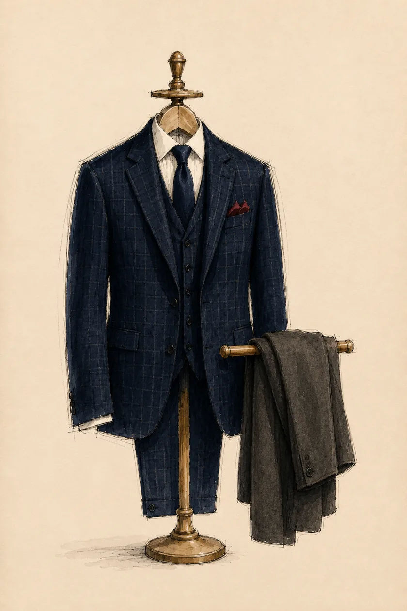
- Fine stripes, tight checks, and busy weaves can cause moiré: that shimmering, wavy, colour-distorted pattern where the fabric’s weave clashes with the camera sensor. Modern cameras (many without the old anti-aliasing filter) show it more than ever, and it’s most visible when the pattern fills the frame, which is exactly what a suit does in a portrait. Stick to solids or a soft, open texture for the big day.
How do I pick the right shade for my wedding?
Match the colour to your light and your time of day, then to the palette of the party. Daytime and outdoors: navy, mid-grey, or an earth tone all sing. Evening or heavy flash: navy, charcoal, or midnight blue.
A few pointers we give every groom:
- Look richer than the groomsmen. If they’re in mid-grey, go navy or charcoal so you separate from the crowd in group shots.
- Contrast with the dress, don’t compete. White dress plus navy or charcoal is a classic for a reason.
- Bring your season in. Warm months forgive lighter tones; a winter or evening wedding wants depth.
None of this needs to be stressful. That’s genuinely our job. See coordinating your groomsmen and the groom’s suit for how the whole look comes together.
When you’re ready, bring your venue and your day’s timeline to a first fitting. We’ll look at how your photos will actually be shot, then pick a colour and fabric that looks like you, in the album, for the rest of your life. Book an appointment or start designing your suit whenever it suits you.